Advertisements
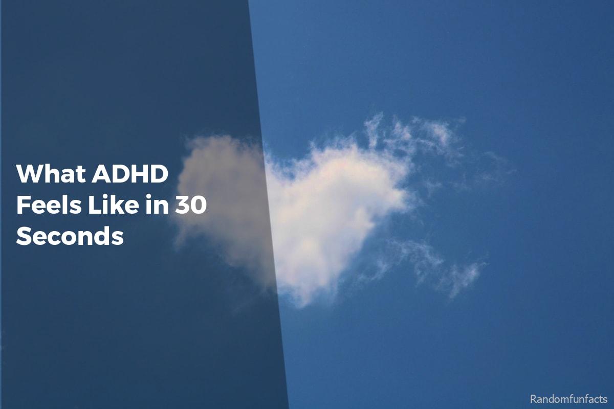
Some websites don’t announce themselves loudly. You don’t search for them. You stumble into them, spend a few quiet minutes, and leave seeing something slightly differently.
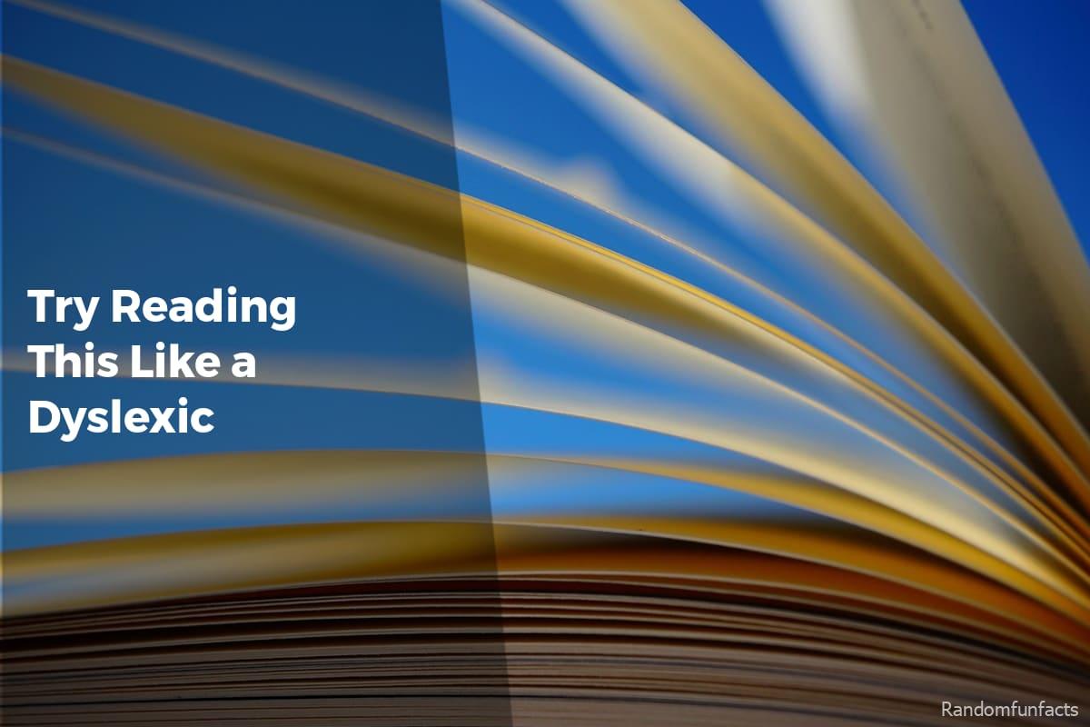
The tools below fall into that category. They’re not games, not lessons, not diagnoses. They’re small browser-based experiences that simulate how reading and processing text can feel when letters don’t stay put.
Table of Contents
(Click to Toggle)
- 1. Dyslexia Simulator : A simple reading disruption test
- 2. Readability Lab : Controlled experiments in text clarity
- 3. Text Distortion Test : When letters refuse to behave
- 4. Letter Drift : Slow-motion text instability
- 5. Reading Glasses : Filters for text perception
- 6. Mirror Words : Directional confusion simulator
- 7. Focus Blur : Peripheral distraction tool
- 8. Jumble Type : Internal letter scrambling
- 9. Spacing Stress Test : Line and word spacing extremes
- 10. Motion Reading : Subtle animated text flow
- 11. Contrast Shift : Fading text visibility test
- 12. Phoneme Swap : Sound-based confusion test
- 13. Scroll Friction : Reading with delayed response
- 14. Visual Noise Reader : Background interference test
- 15. Sentence Maze : Nonlinear reading paths
Why “This Test Simulates Dyslexia” is worth your time
They offer fresh experiences: These sites don’t explain dyslexia in paragraphs. They let you feel fragments of it through interaction.
They break routine: We’re used to reading without thinking about the act itself. These tools interrupt that comfort.
They spark empathy: A few altered letters can quietly change how you understand accessibility.
How This List Is Framed
All of these sites are browser-based, minimal, and slightly strange. They do one thing. They don’t shout. They’re easy to overlook unless you’re paying attention.
The Curated Selection
1. Dyslexia Simulator : A simple reading disruption test
What it is:
A webpage that subtly shifts letters as you read a paragraph.
Category: Accessibility
Why it stands out:
- No instructions beyond “read”
- Movement is gentle, not exaggerated
- Feels easy to dismiss until it isn’t
Best for: Experiencing discomfort without theatrics.
2. Readability Lab : Controlled experiments in text clarity
What it is:
A sandbox where font weight, spacing, and alignment subtly change.
Category: Research
Why it stands out:
- Side-by-side comparisons
- No right or wrong setting
- Shows how small tweaks matter
Best for: Noticing what usually goes unnoticed.
3. Text Distortion Test : When letters refuse to behave
What it is:
A short test that introduces random character swaps mid-sentence.
Category: Experiment
Why it stands out:
- Unpredictable disruptions
- Reading speed drops fast
- No explanation screens
Best for: Feeling cognitive friction quickly.
4. Letter Drift : Slow-motion text instability
What it is:
Letters subtly slide out of alignment as you read.
Category: Visual
Why it stands out:
- Almost imperceptible movement
- Builds discomfort over time
- Hard to explain to someone else
Best for: Understanding cumulative strain.
5. Reading Glasses : Filters for text perception
What it is:
A tool that overlays visual filters onto plain text.
Category: Accessibility
Why it stands out:
- Instant on/off contrast
- No saved settings
- Feels temporary and fragile
Best for: Short, reflective sessions.

Advertisements
6. Mirror Words : Directional confusion simulator
What it is:
A reading test where certain letters flip orientation.
Category: Cognitive
Why it stands out:
- Targets specific letter pairs
- Disrupts word recognition
- Minimal interface
Best for: Seeing how letters can mislead.
7. Focus Blur : Peripheral distraction tool
What it is:
Blurs surrounding text while keeping the center sharp.
Category: Visual
Why it stands out:
- Forces narrow focus
- Mimics visual fatigue
- No customization rabbit hole
Best for: Understanding reading exhaustion.
8. Jumble Type : Internal letter scrambling
What it is:
A paragraph where middle letters shift but words remain intact.
Category: Language
Why it stands out:
- Readable yet uncomfortable
- Challenges pattern recognition
- Feels deceptively easy
Best for: Testing assumptions about readability.
9. Spacing Stress Test : Line and word spacing extremes
What it is:
A tool that compresses and expands spacing dynamically.
Category: Design
Why it stands out:
- No optimal setting provided
- Visual discomfort escalates
- Highlights layout sensitivity
Best for: Designers and curious readers.
10. Motion Reading : Subtle animated text flow
What it is:
Words gently move along a horizontal path.
Category: Experimental
Why it stands out:
- Movement competes with comprehension
- No pause button
- Feels oddly stressful
Best for: Feeling attention drift.

11. Contrast Shift : Fading text visibility test
What it is:
Text contrast slowly changes while you read.
Category: Visual
Why it stands out:
- Gradual, not abrupt
- Mimics eye strain
- No alerts or metrics
Best for: Quiet awareness building.
12. Phoneme Swap : Sound-based confusion test
What it is:
Written text subtly replaces phonetic equivalents.
Category: Language
Why it stands out:
- Hard to detect at first
- Challenges internal reading voice
- Feels mentally tiring
Best for: Exploring sound-to-text friction.
13. Scroll Friction : Reading with delayed response
What it is:
Scrolling lags unpredictably while reading.
Category: Interaction
Why it stands out:
- Breaks reading rhythm
- Creates mild frustration
- No explanation given
Best for: Understanding flow disruption.
14. Visual Noise Reader : Background interference test
What it is:
Introduces faint patterns behind text.
Category: Visual
Why it stands out:
- Noise is barely visible
- Reading becomes slower
- Easy to underestimate impact
Best for: Experiencing sensory overload.
15. Sentence Maze : Nonlinear reading paths
What it is:
Sentences subtly rearrange their visual order.
Category: Cognitive
Why it stands out:
- Meaning stays intact
- Navigation feels uncertain
- Quietly unsettling
Best for: Feeling disorientation without chaos.
Bonus Mentions
Glyph Shift
https://glyphshift.net
A minimal page that replaces familiar letters with near-identical symbols.
Reading Tilt
https://readingtilt.com
Text slowly rotates by a degree or two, just enough to be distracting.
Echo Read
https://echoread.org
A silent delay between seeing and highlighting words as you read.
Final Verdict: Is it worth it?
Useful tools often stay hidden because they don’t fit neatly into categories. They’re not productivity boosters or educational platforms. They simply exist.
In a web full of noise, discovery still matters. Especially when a quiet page can shift how you notice something as ordinary as reading.
Simplicity, in these cases, does more than explanation ever could.
Advertisements