Advertisements
Some websites don’t ask you to read faster. They ask you to read differently.
If you’ve ever skimmed a page and felt oddly tired, or noticed how certain layouts feel heavier than others, you’re already close to what this list explores. These are tools built around friction, not speed. Around attention, not volume.
Table of Contents
(Click to Toggle)
- 1. Dyslexia Simulator : A shifting window into unstable text
- 2. TypeShift : Fonts that refuse to sit still
- 3. Reading Ruler : One line at a time
- 4. Textise : Stripping pages down to words
- 5. LineFocus : Visual boundaries for wandering eyes
- 6. Spaced Reader : Letting words breathe
- 7. Colorful Words : Syntax through color
- 8. LetterSwap : Controlled chaos
- 9. Quiet Reader : Less contrast, less strain
- 10. FocusFrame : Reading through a window
- 11. PlainText View : Nothing but characters
- 12. Word Weight : Emphasis without bold
- 13. MirrorText : Reading against habit
- 14. Chunk Reader : Breaking text into pieces
- 15. Slow Scroll : Pace as a feature
Why “Try Reading This Like a Dyslexic” is worth your time
They offer fresh experiences: Small tools like these don’t try to solve everything. They solve one narrow problem, often in a way that feels unfinished or personal. That’s where new perspectives tend to show up.
They break routine: Reading is habitual. We rarely question how text is presented until something disrupts it. Discovery creates those disruptions without demanding commitment.
They spark empathy: Tools built for accessibility often reveal how fragile our default reading assumptions really are.
How This List Was Framed
Every site here is browser-based, quiet, and slightly strange. None of them shout. Some barely explain themselves. They’re meant to be tried briefly, noticed, and maybe remembered later.
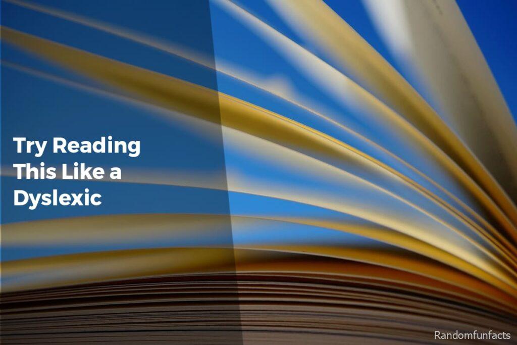
1. Dyslexia Simulator : A shifting window into unstable text
What it is: A simple web page that alters text spacing and letter stability to mimic common dyslexic reading challenges.
Category: Accessibility
Why it stands out:
- Creates discomfort without being overwhelming
- No setup or instructions required
- Often overlooked because it looks unfinished
Best for:
Understanding how small visual changes affect comprehension.
2. TypeShift : Fonts that refuse to sit still
What it is: An experimental font playground that subtly shifts letterforms as you read.
Category: Typography
Why it stands out:
- Challenges the idea of static text
- Feels more like an art experiment than a tool
- Rarely shared outside design circles
Best for:
Designers curious about how form affects readability.
3. Reading Ruler : One line at a time
What it is: A minimal overlay that isolates a single line of text while dimming the rest.
Category: Reading Aid
Why it stands out:
- Removes visual noise instead of adding features
- Works on almost any webpage
- Easy to dismiss, easy to miss
Best for:
Readers who lose their place frequently.
4. Textise : Stripping pages down to words
What it is: A tool that converts webpages into plain, linear text.
Category: Minimalism
Why it stands out:
- Removes layout as a variable
- Feels dated in a comforting way
- Rarely recommended despite its usefulness
Best for:
Anyone overwhelmed by modern web layouts.
5. LineFocus : Visual boundaries for wandering eyes
What it is: A browser-based focus tool that highlights a horizontal reading band.
Category: Focus
Why it stands out:
- Uses space instead of color
- Adjustable without menus
- Quietly effective, rarely discussed
Best for:
Long-form reading sessions.

Advertisements
6. Spaced Reader : Letting words breathe
What it is: A reader that increases letter and line spacing dynamically.
Category: Accessibility
Why it stands out:
- Focuses on spacing, not fonts
- Subtle enough to forget it’s on
- Often overshadowed by flashier tools
Best for:
Readers sensitive to dense text blocks.
7. Colorful Words : Syntax through color
What it is: A web app that colors parts of speech differently.
Category: Language
Why it stands out:
- Turns grammar into a visual map
- Feels playful without being childish
- Niche enough to stay under the radar
Best for:
Visual learners exploring sentence structure.
8. LetterSwap : Controlled chaos
What it is: A text tool that swaps internal letters while keeping words readable.
Category: Experiment
Why it stands out:
- Demonstrates cognitive shortcuts
- Uncomfortable by design
- Rarely framed as a reading aid
Best for:
Understanding how the brain anticipates words.
9. Quiet Reader : Less contrast, less strain
What it is: A reader mode with softened colors and muted contrast.
Category: Visual Comfort
Why it stands out:
- Avoids pure black and white
- No customization overload
- Often mistaken for a theme demo
Best for:
Extended reading on bright screens.
10. FocusFrame : Reading through a window
What it is: A movable frame that reveals only part of the page.
Category: Focus
Why it stands out:
- Physical metaphor feels intuitive
- Works without altering text
- Rarely promoted beyond word of mouth
Best for:
People who get visually lost on pages.

11. PlainText View : Nothing but characters
What it is: A site that renders any pasted text in a neutral, monospaced layout.
Category: Minimalism
Why it stands out:
- Removes typographic personality
- Highlights structure over style
- Easy to underestimate
Best for:
Comparing how layout affects comprehension.
12. Word Weight : Emphasis without bold
What it is: A tool that subtly varies word thickness based on frequency.
Category: Typography
Why it stands out:
- Uses weight instead of color
- Encourages slower reading
- Still largely experimental
Best for:
Readers who skim unintentionally.
13. MirrorText : Reading against habit
What it is: A site that flips or reverses text orientation.
Category: Experiment
Why it stands out:
- Disrupts automatic reading
- Feels more like a thought exercise
- Rarely framed as useful
Best for:
Exploring how direction affects recognition.
14. Chunk Reader : Breaking text into pieces
What it is: A reader that groups words into small, adjustable chunks.
Category: Reading Aid
Why it stands out:
- Reduces cognitive load
- Visually unconventional
- Often misunderstood at first glance
Best for:
Readers who prefer rhythm over flow.
15. Slow Scroll : Pace as a feature
What it is: A web reader that limits scroll speed intentionally.
Category: Focus
Why it stands out:
- Forces attention through constraint
- Feels almost stubborn
- Easy to dismiss as unnecessary
Best for:
People who rush through text without meaning to.
Bonus Mentions
GlyphPlay
https://glyphplay.io
A small playground for testing unusual letterforms and spacing combinations.
SoftContrast
https://softcontrast.com
A quiet tool that lets you tune background and text contrast without presets.
SentenceSteps
https://sentencesteps.org
Presents sentences one segment at a time, encouraging deliberate reading.
Final Verdict: Is it worth it?
The most useful tools often stay hidden because they don’t fit into categories. They don’t promise efficiency. They don’t scale well.
Discovery favors the quiet corners of the web, where simplicity survives and experiments are allowed to feel incomplete.
Reading, like thinking, isn’t one-size-fits-all. Sometimes the best way to understand that is to read the hard way.
Advertisements